Sunbooks
Logo
Brand identity
Product positioning
bookshop
DATE 2023
bookshop
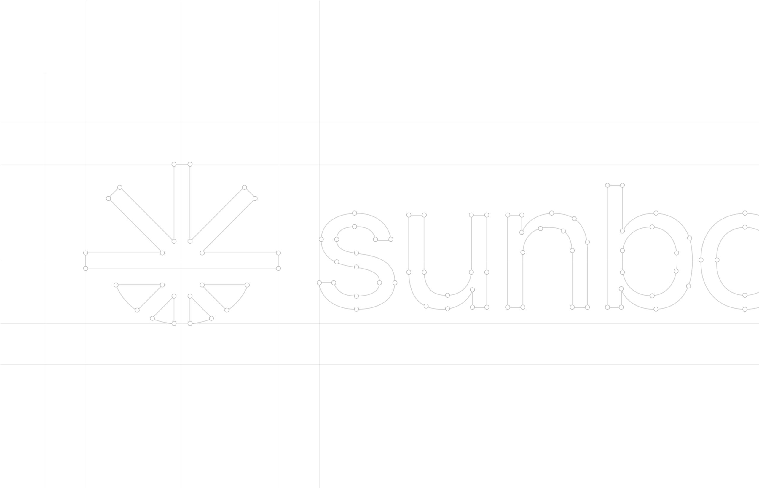
Logo grid and asociation map
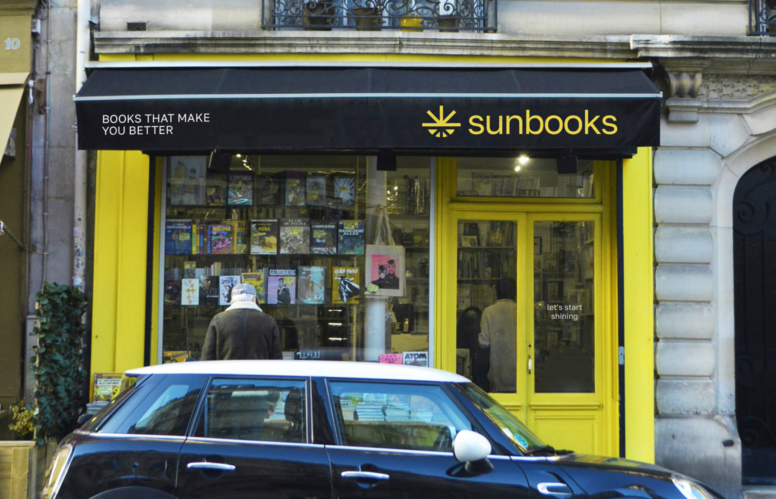
Sunbooks is a new chain of bookshops with an accent on books about self-development and education. The shops will be located in the UK, and there will be an available delivery option to the US and the EU. The target audience is students and people aspiring to gain new skills, knowledge or learn a profession.
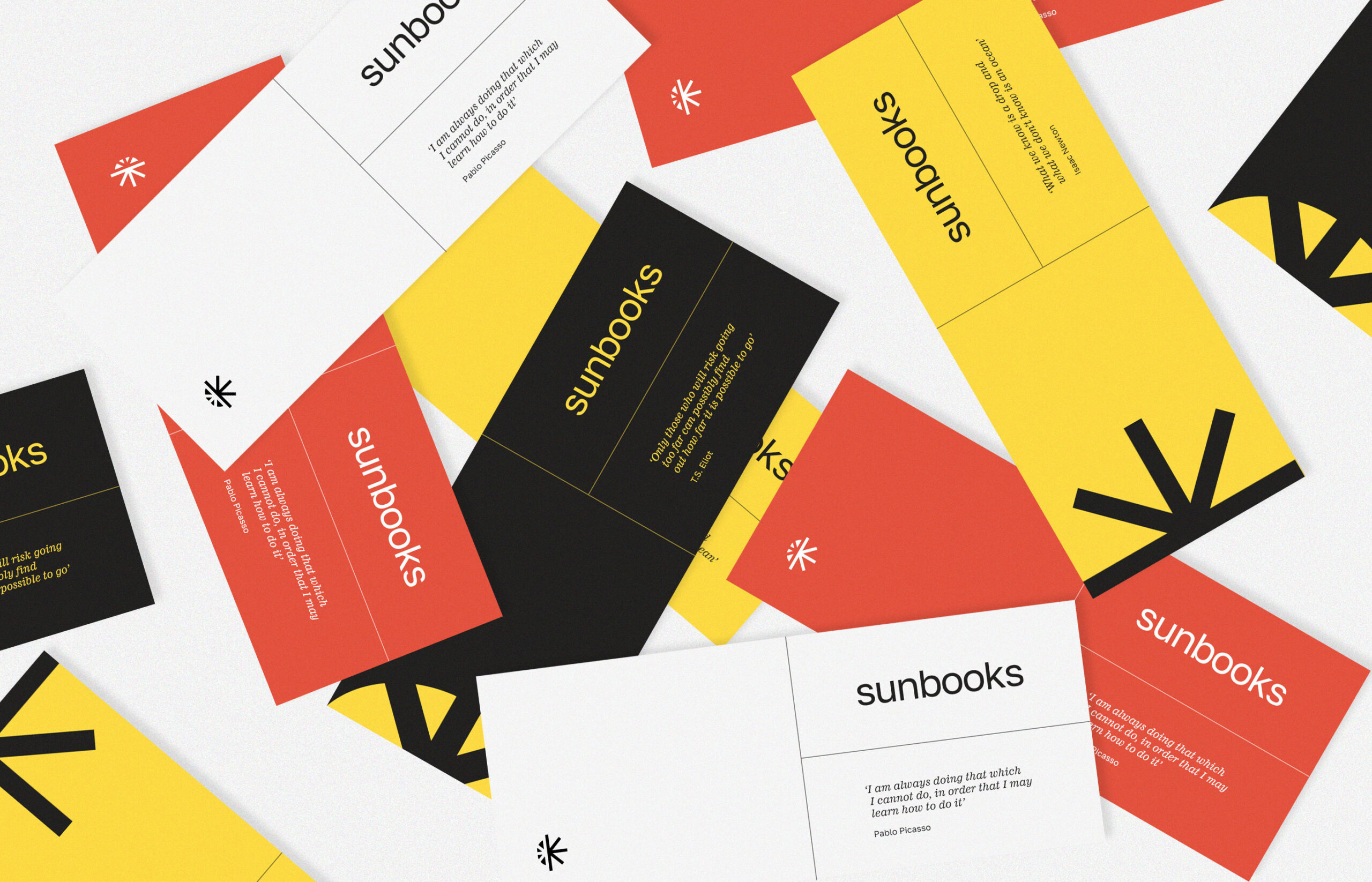
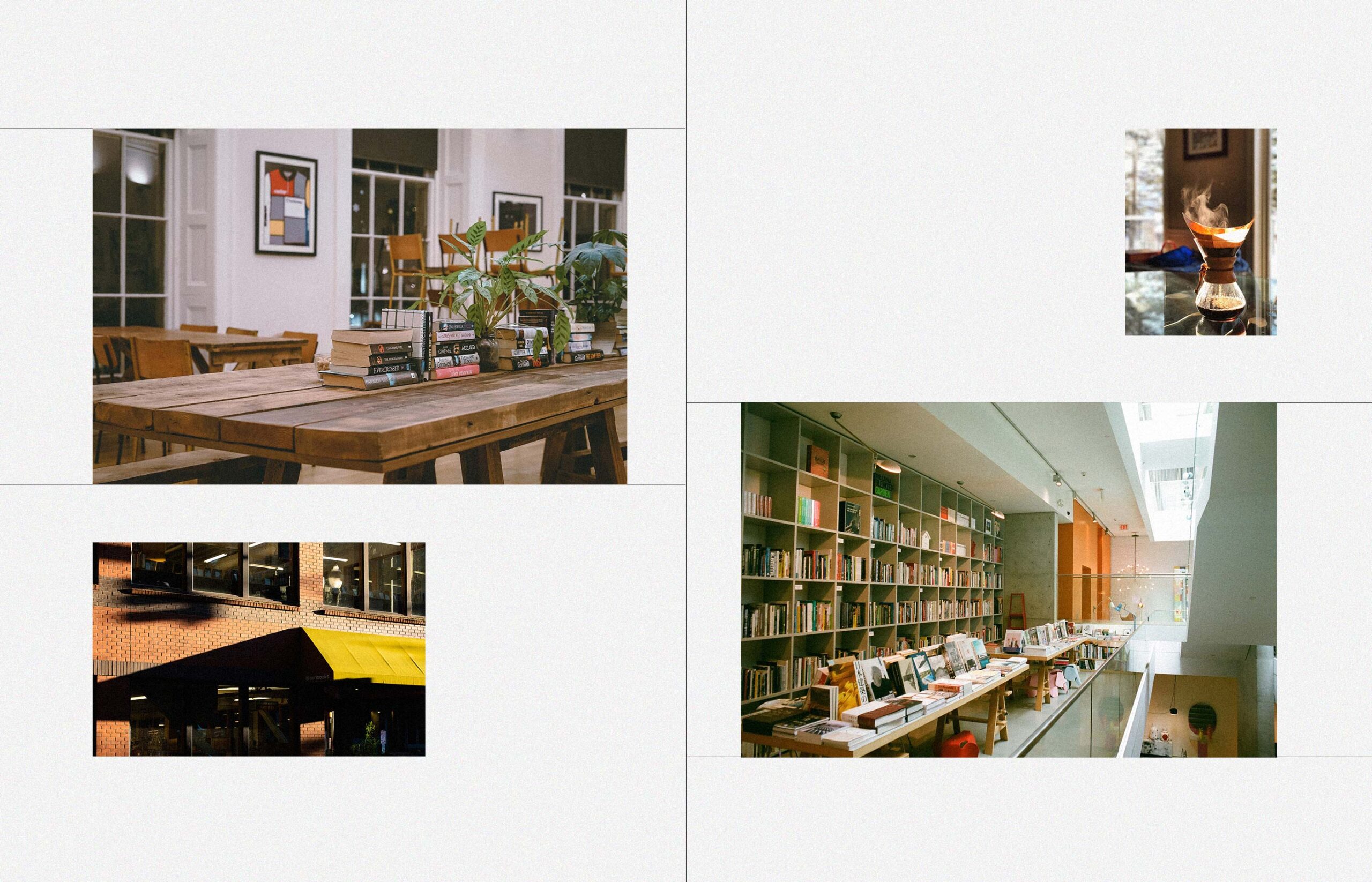
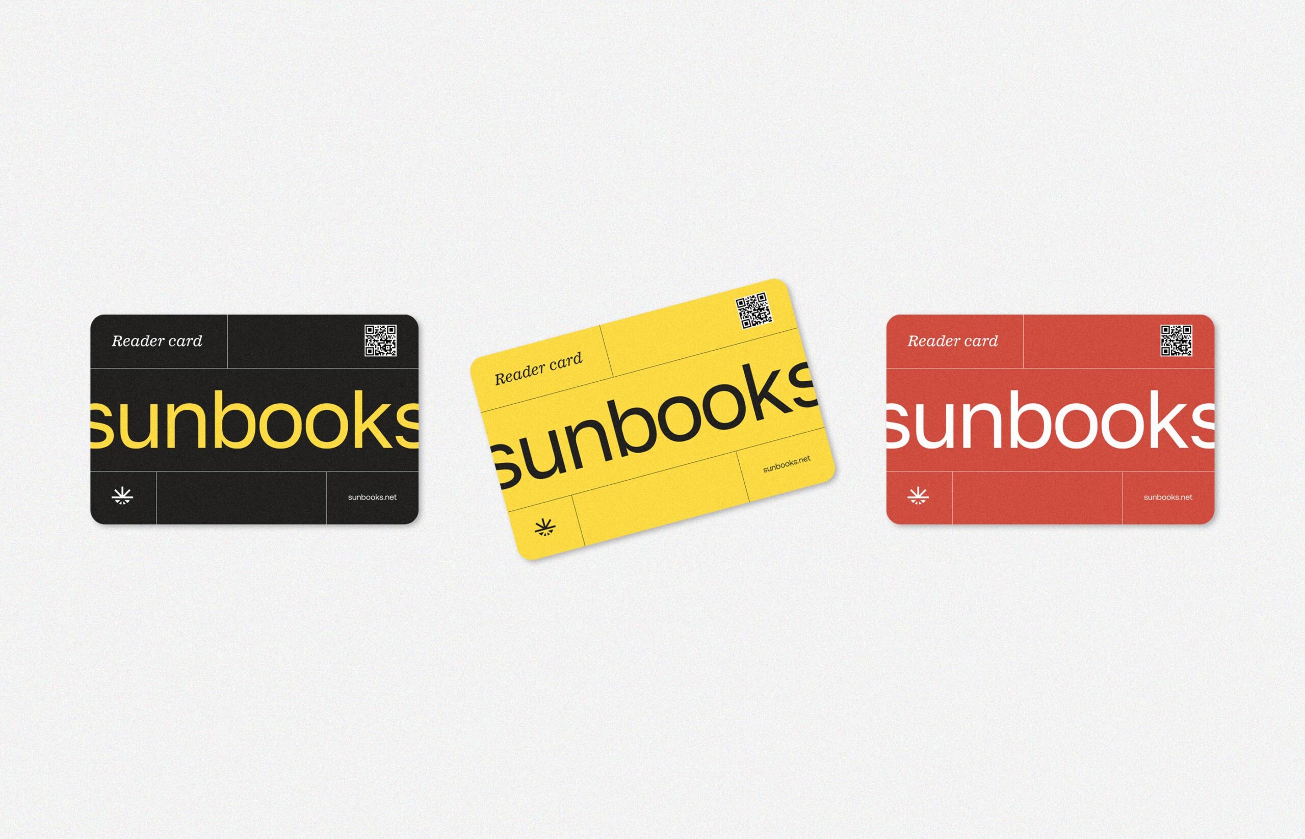
Sunbooks will have reader cards. Cardholders will be able to be in the shop all day long, read any book, and of course, they will take the chance to have a cup of frothy fresh coffee or fragrant tea and a snack. Special events will take place on certain days when authors of books and self-education trainers speak. This creates a community of people aimed at self-development.
LOGO & BRAND IDENTITY
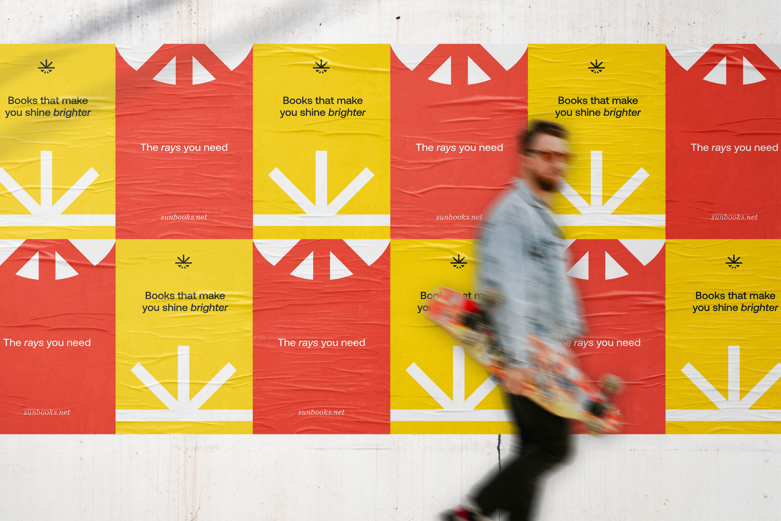
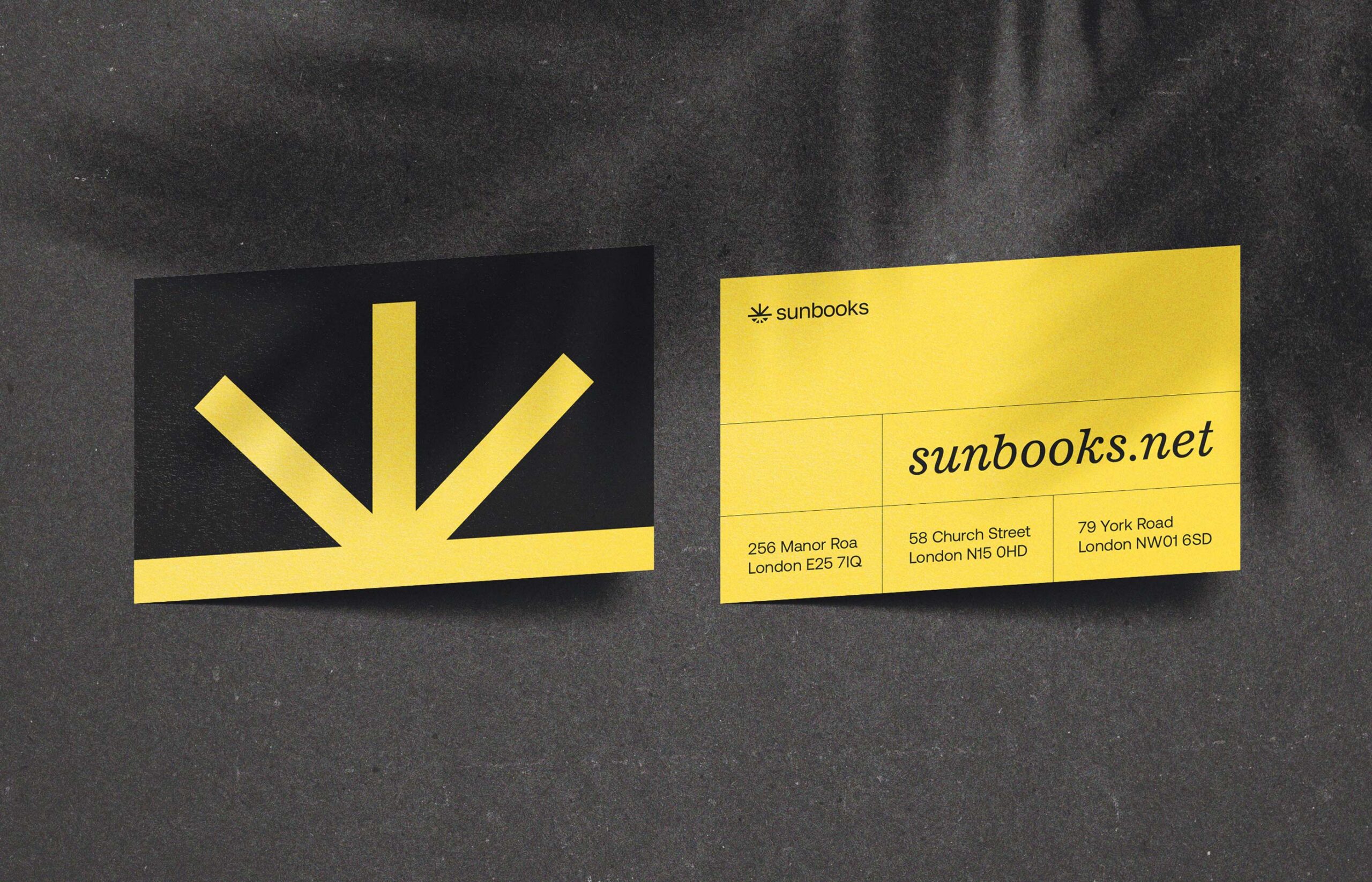
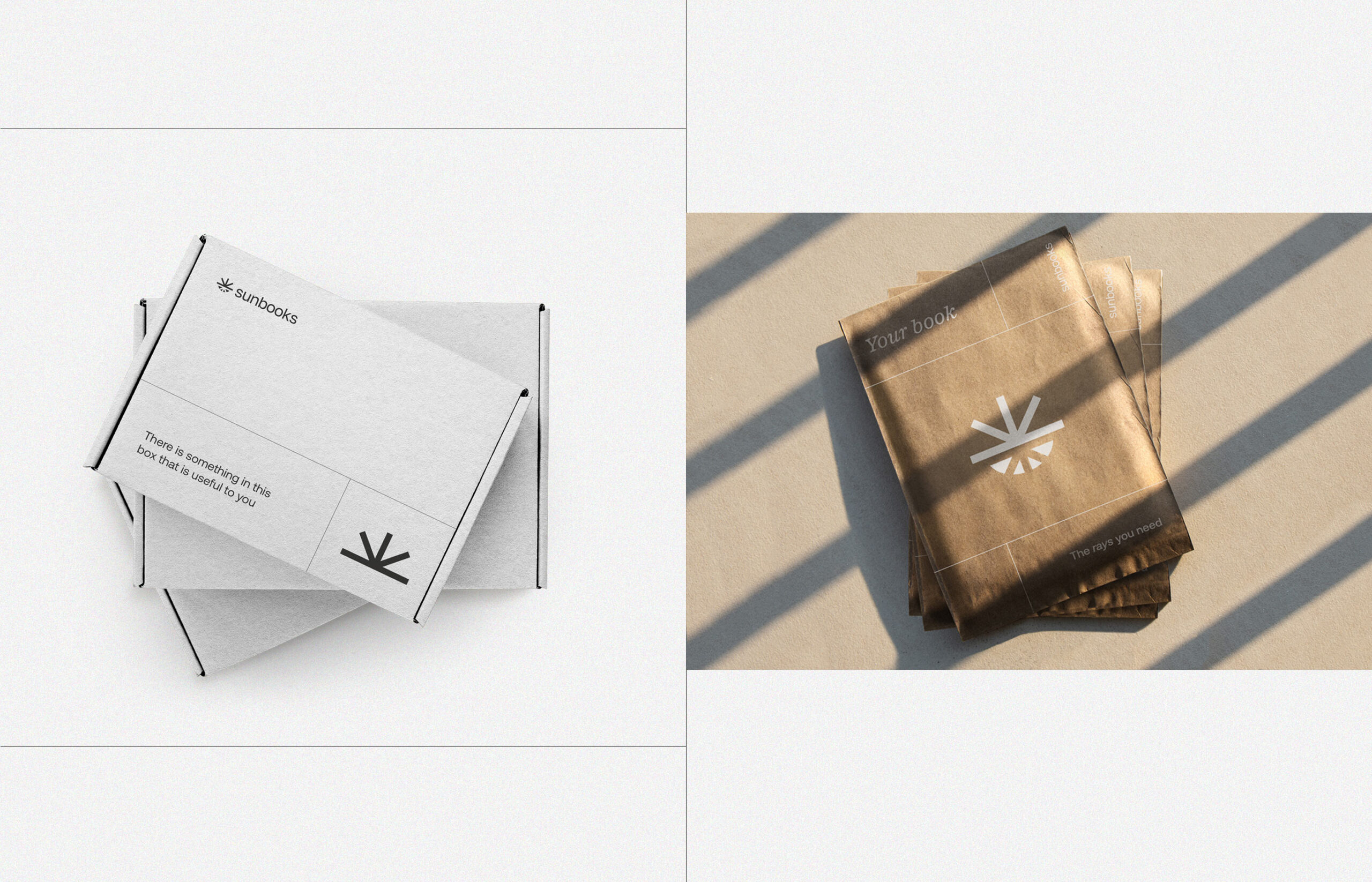
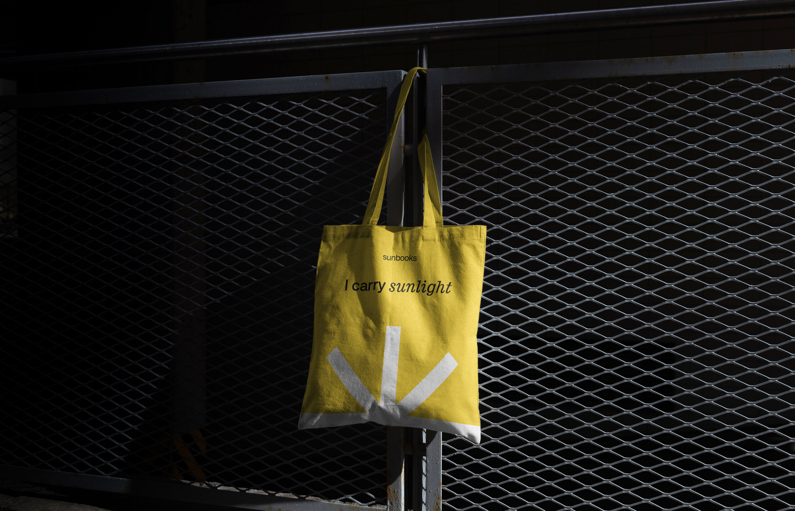
Logo idea: a representation of sunbeams and a book joined together. The upper part of the logo is an open book, the lower one is the knowledge that you have gained. As a whole the logo sign looks like the sun and shows the fullness of knowledge gained.
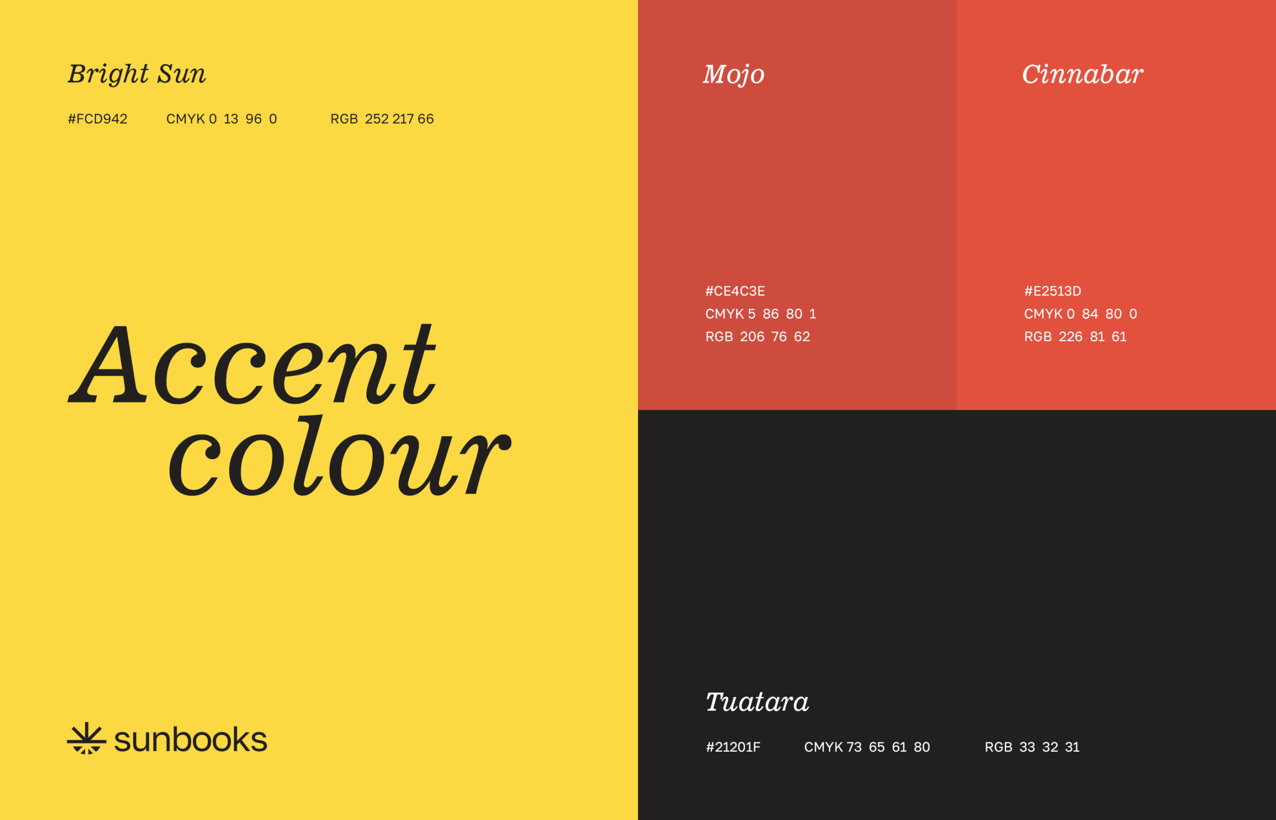
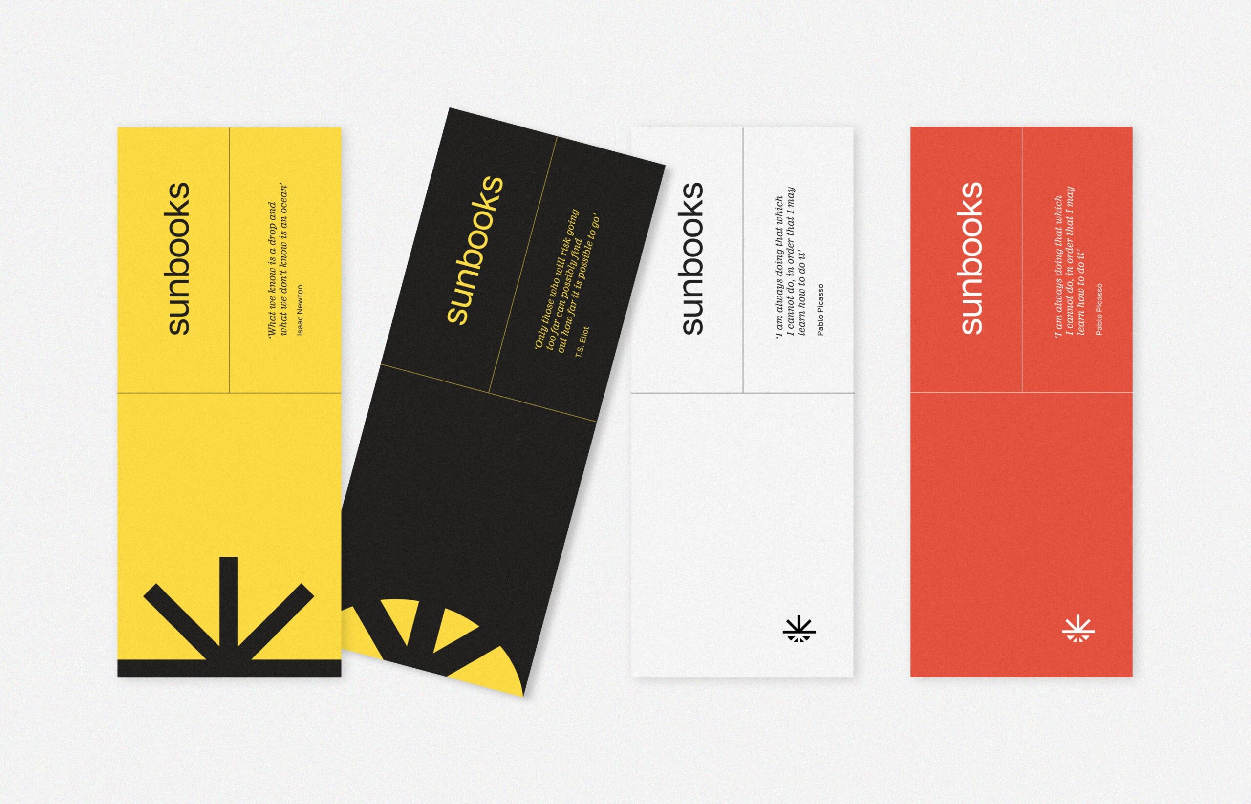
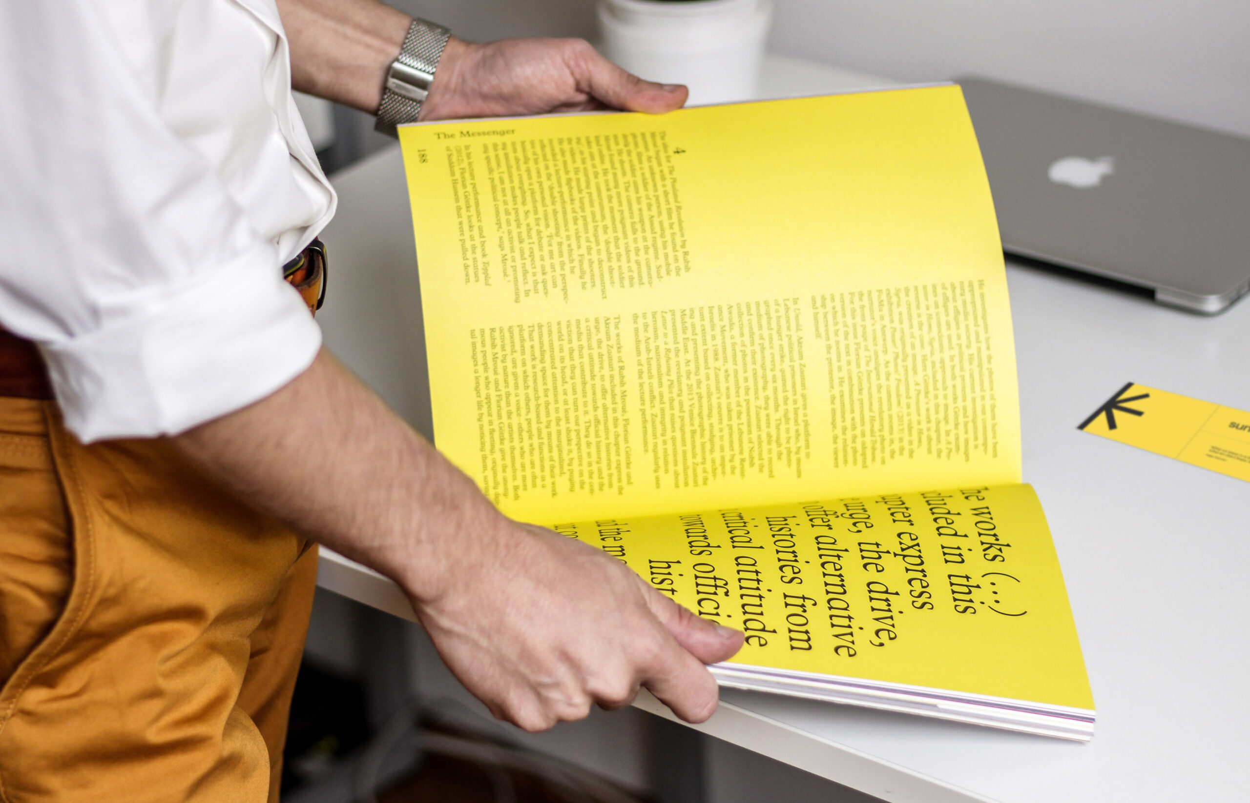
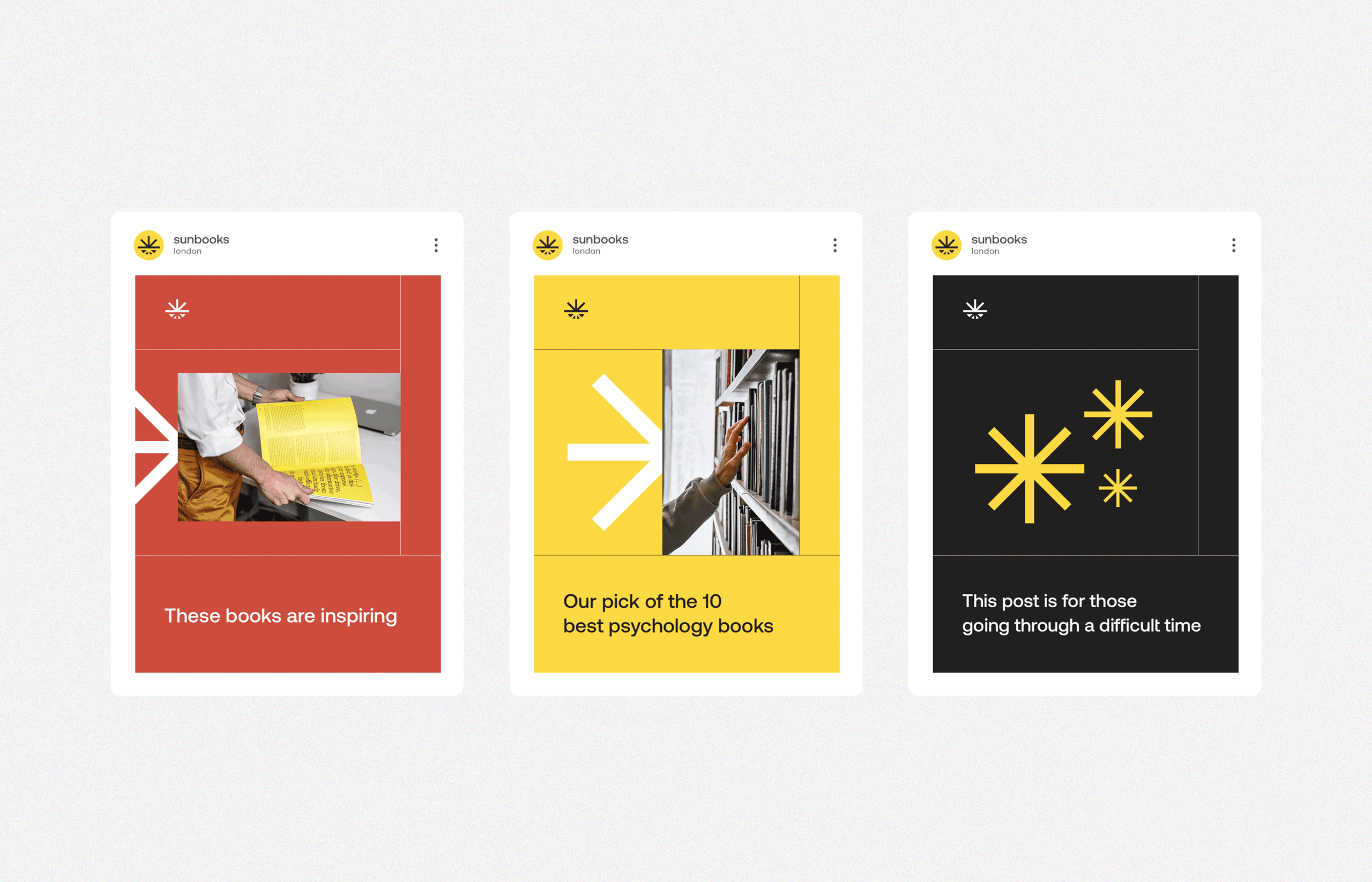
Brand identity: the fonts associate the inseparable link between the present and the past and the colors emphasize personality brightness of Sunbooks’ customers and their aspiration for brilliant knowledge.
