Techouse
it company
DATE 2022
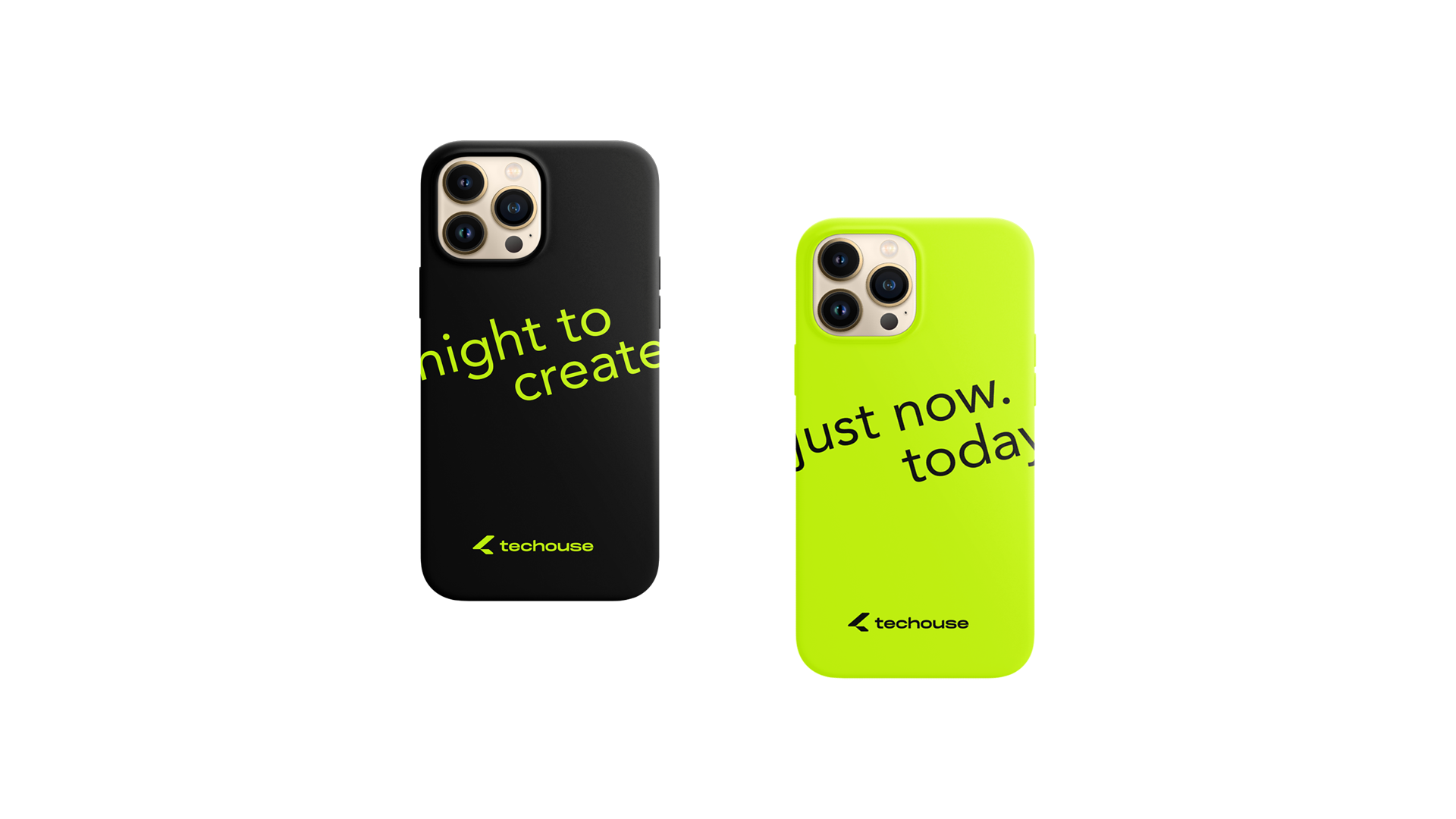
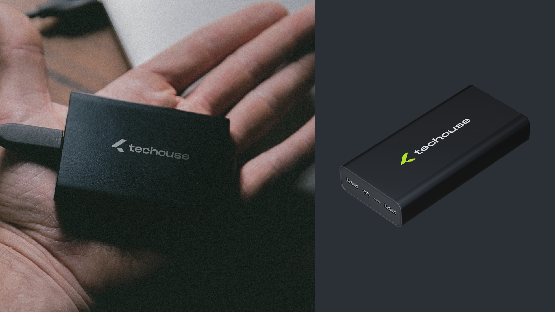
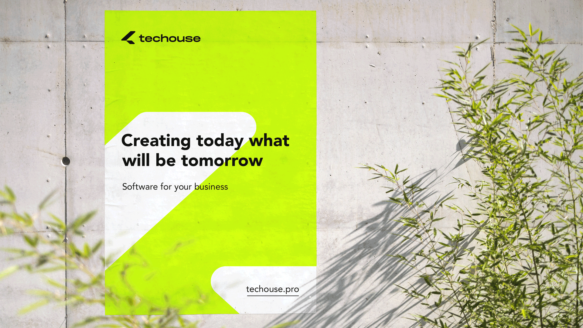
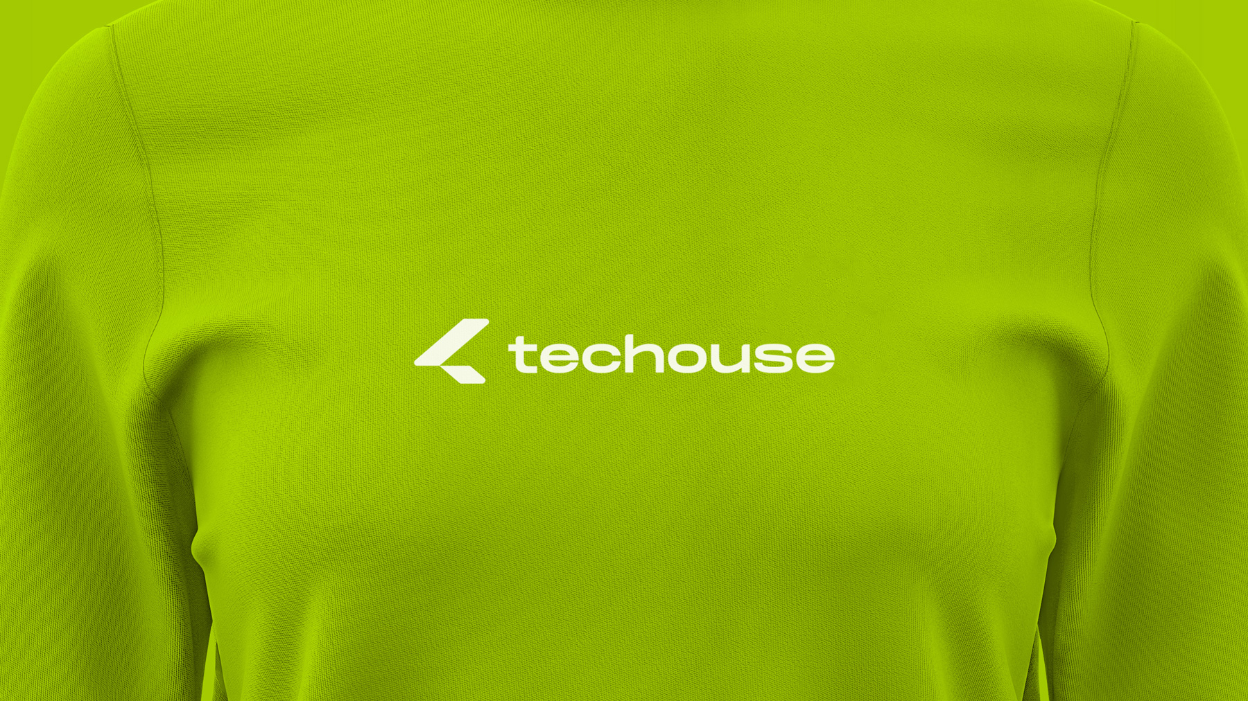
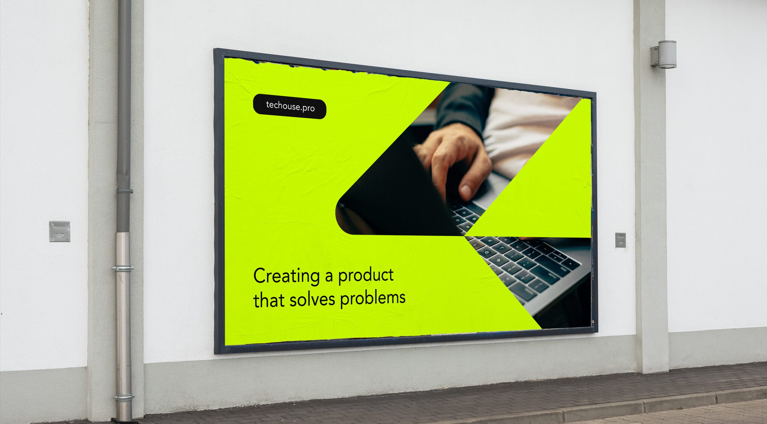
Based on the brief and market analysis we developed a logo and brand identity of the company. They represent all necessary requirements: environmental friendliness and are technologically oriented.
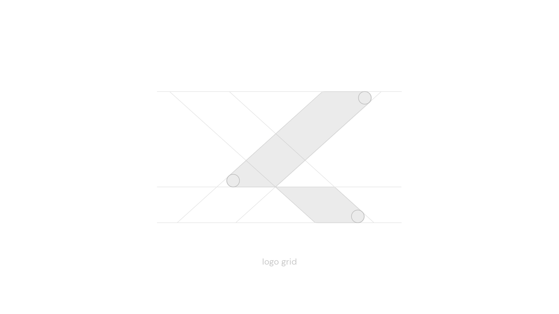
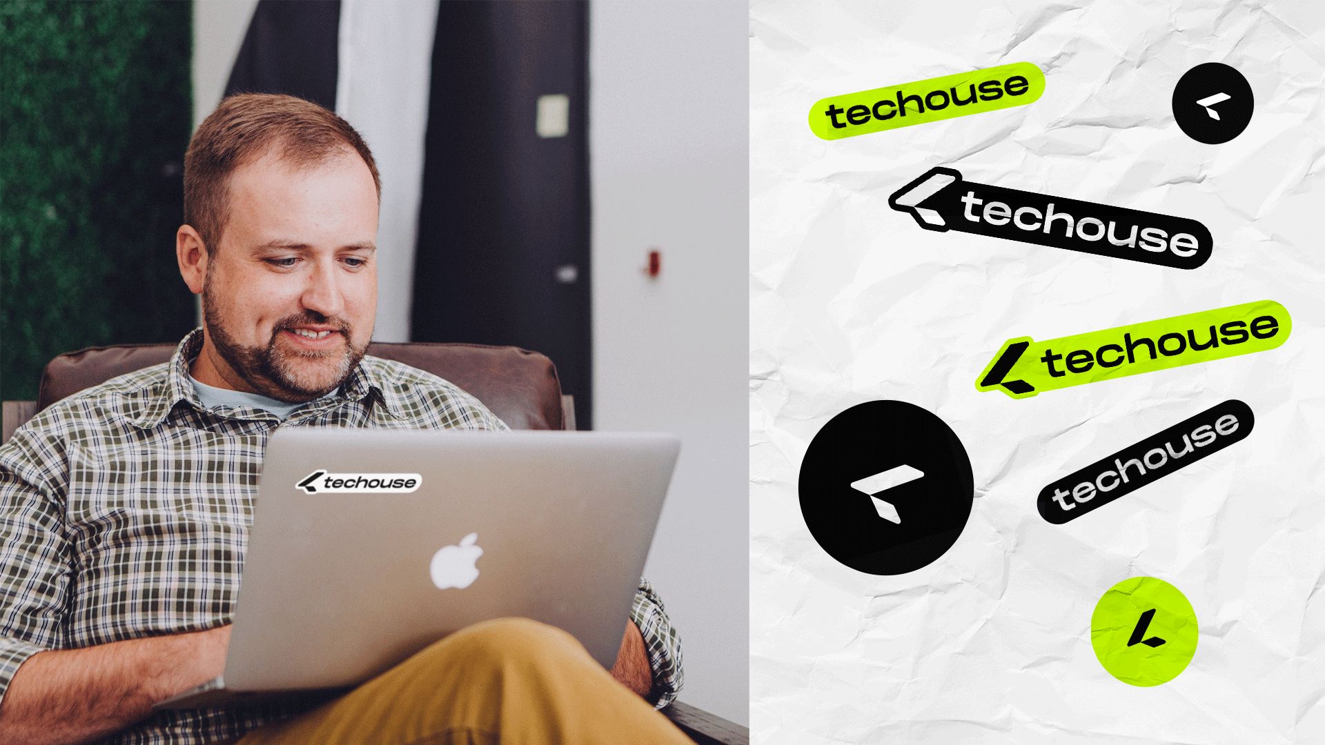
There are two words in the company name – tech and house. We created an association map of those words and symbols for them. The first reflects a roof of a house and the second a laptop. Having joined the symbols together, we got a minimalist sign.
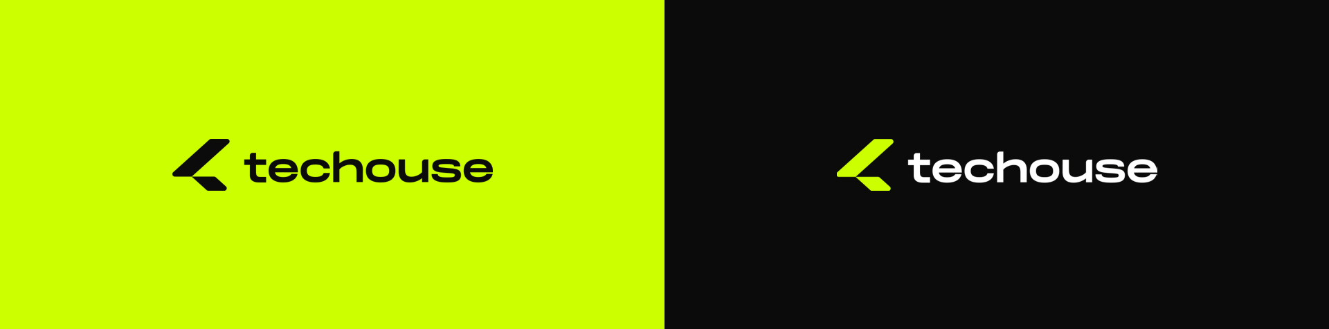
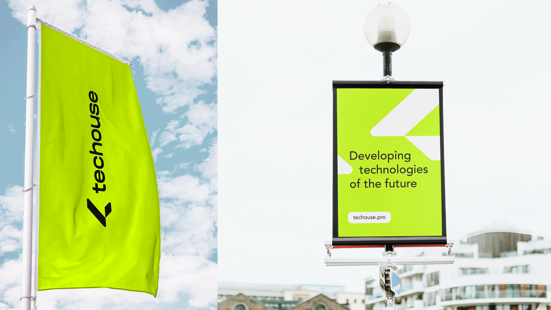
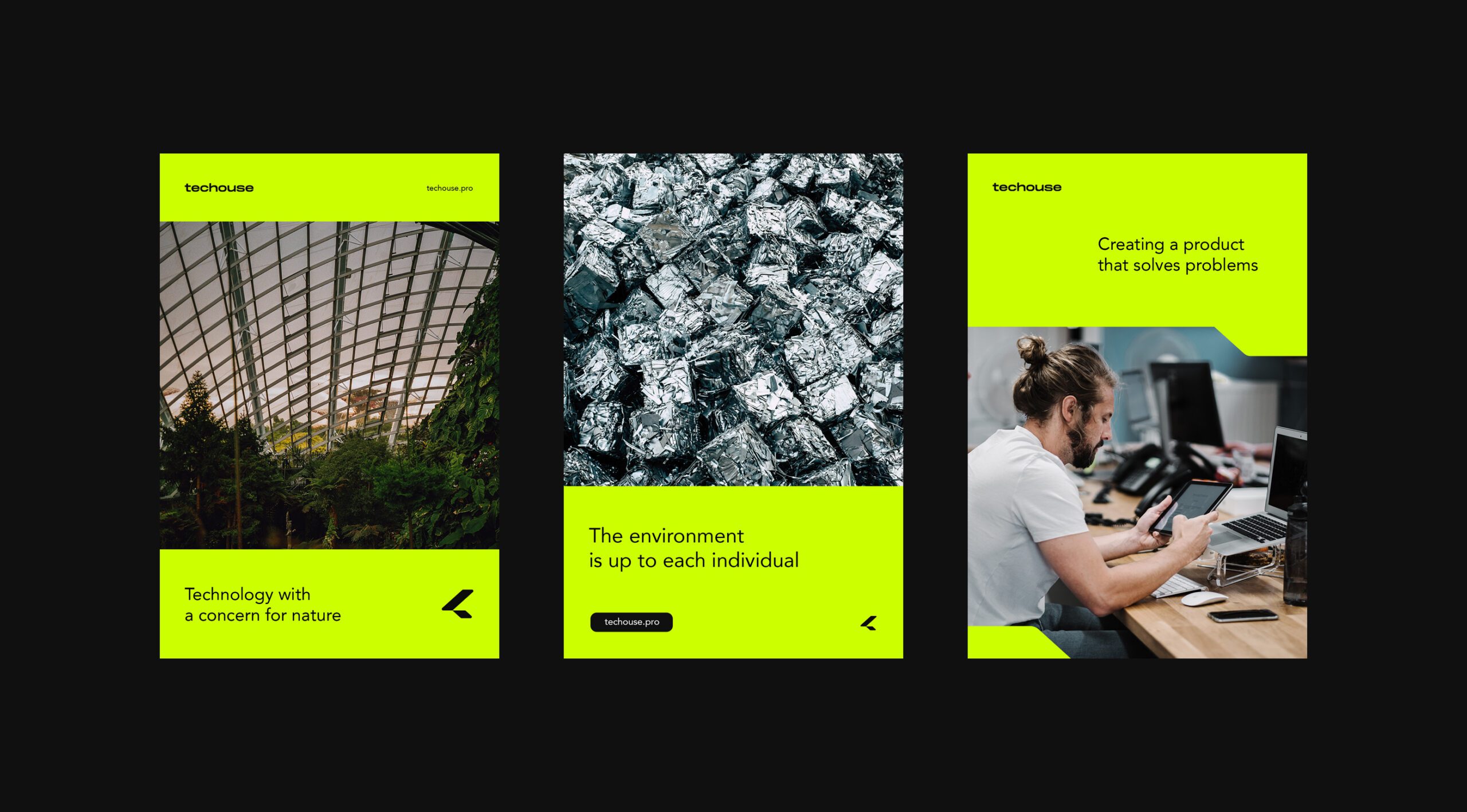
The chosen light green colour connects the company with eco-friendly products.
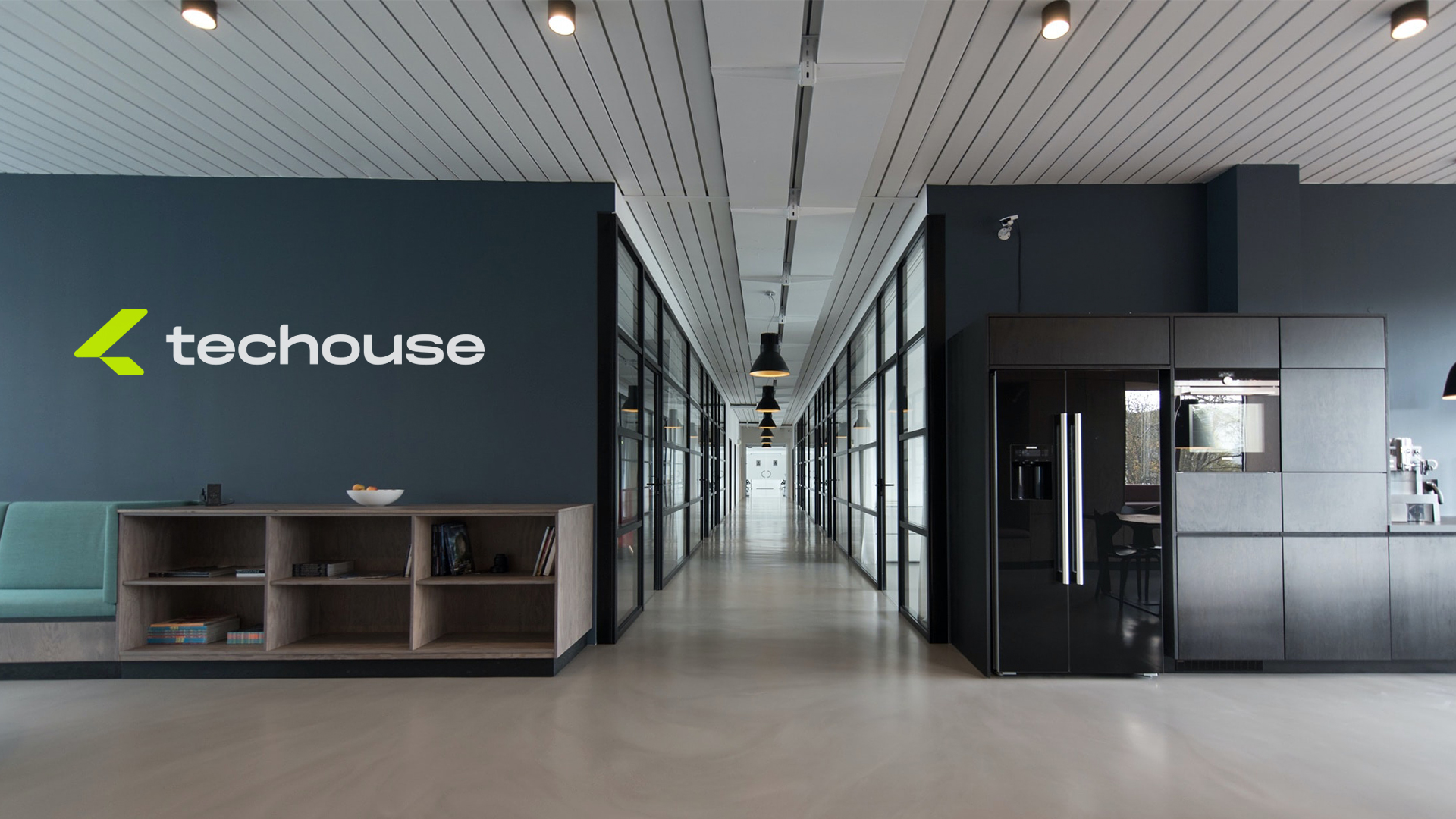
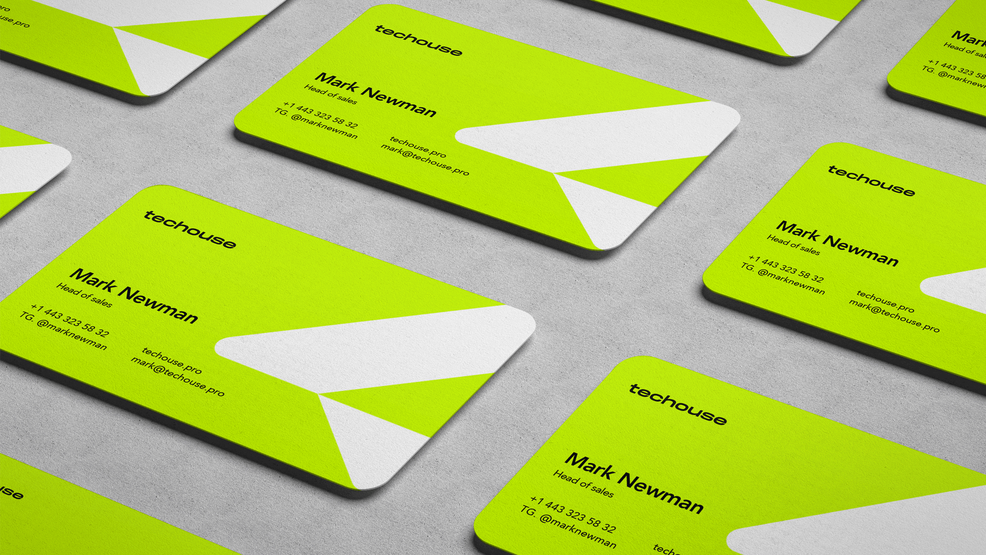
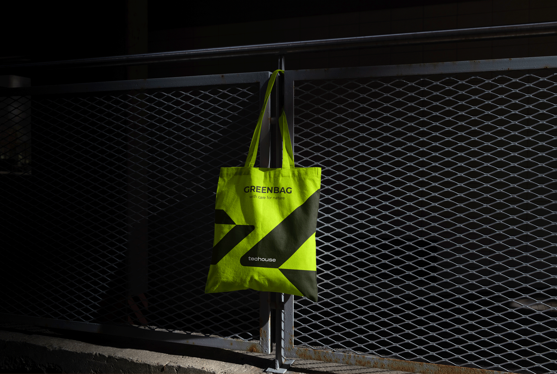
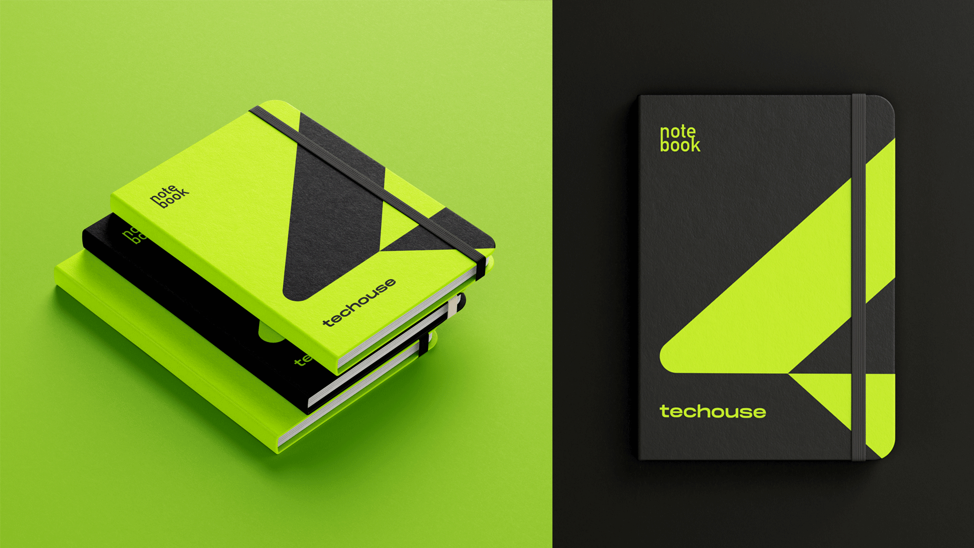
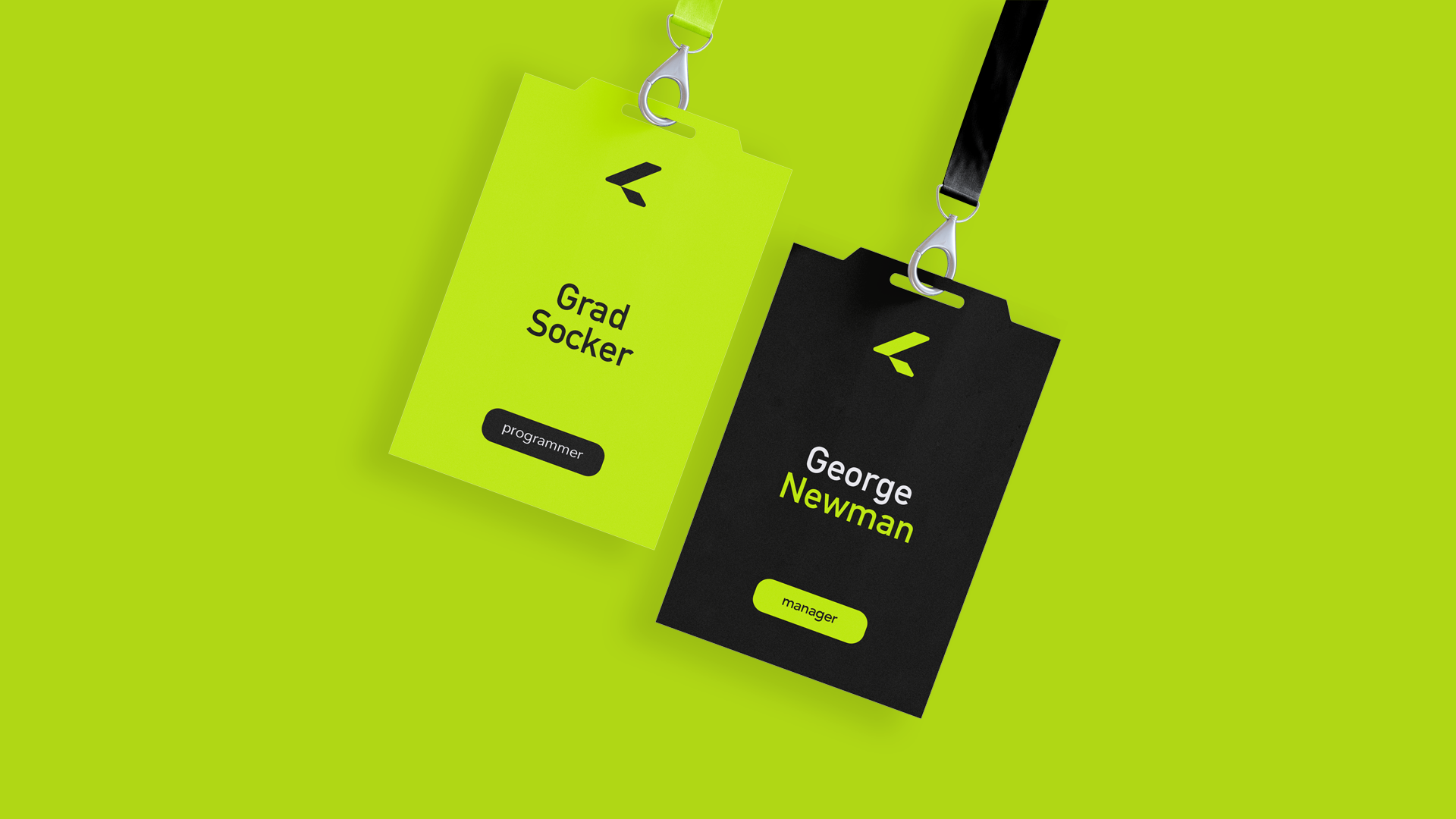
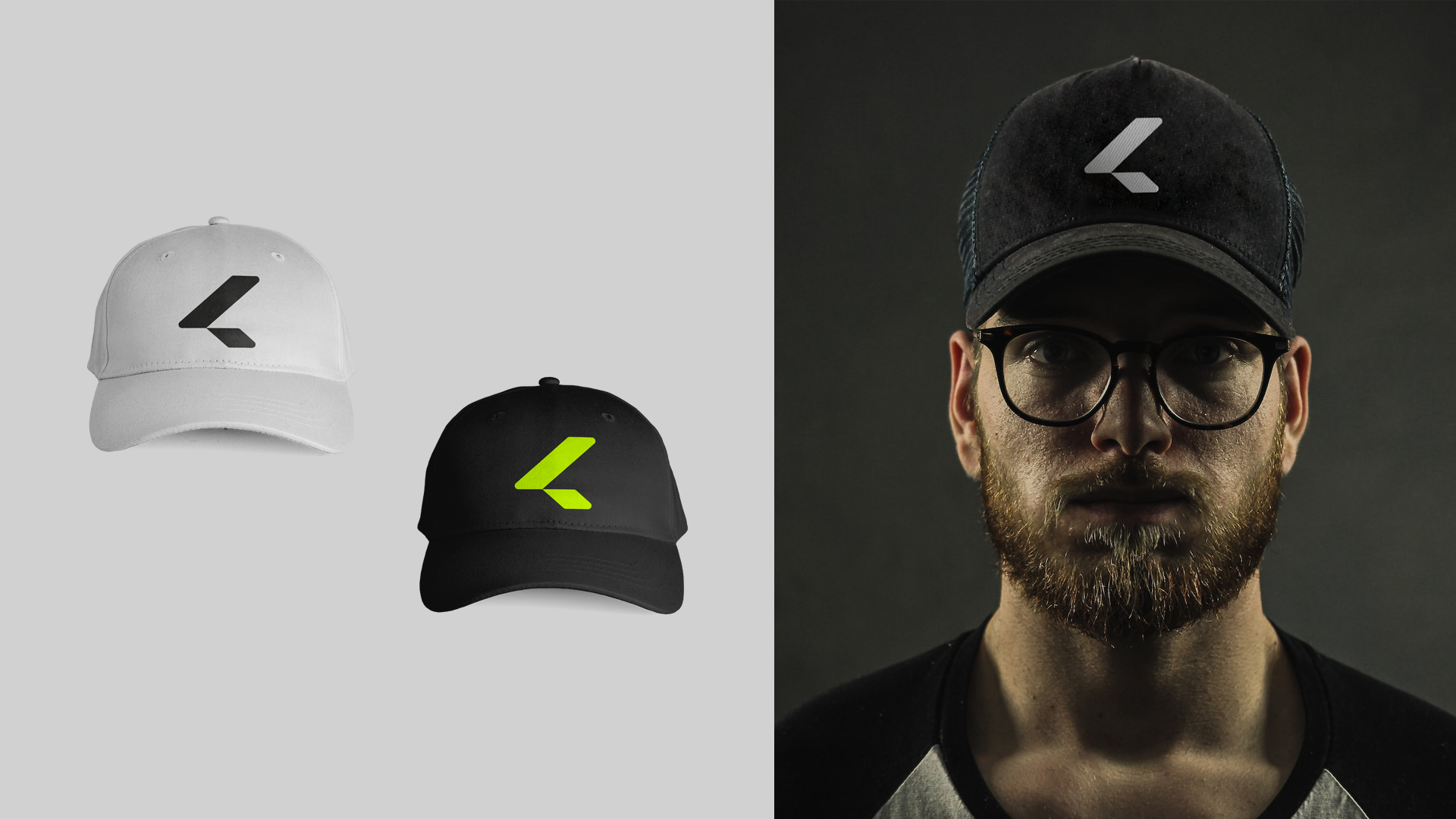
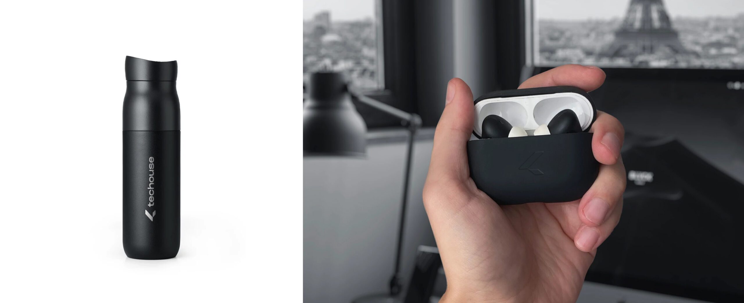
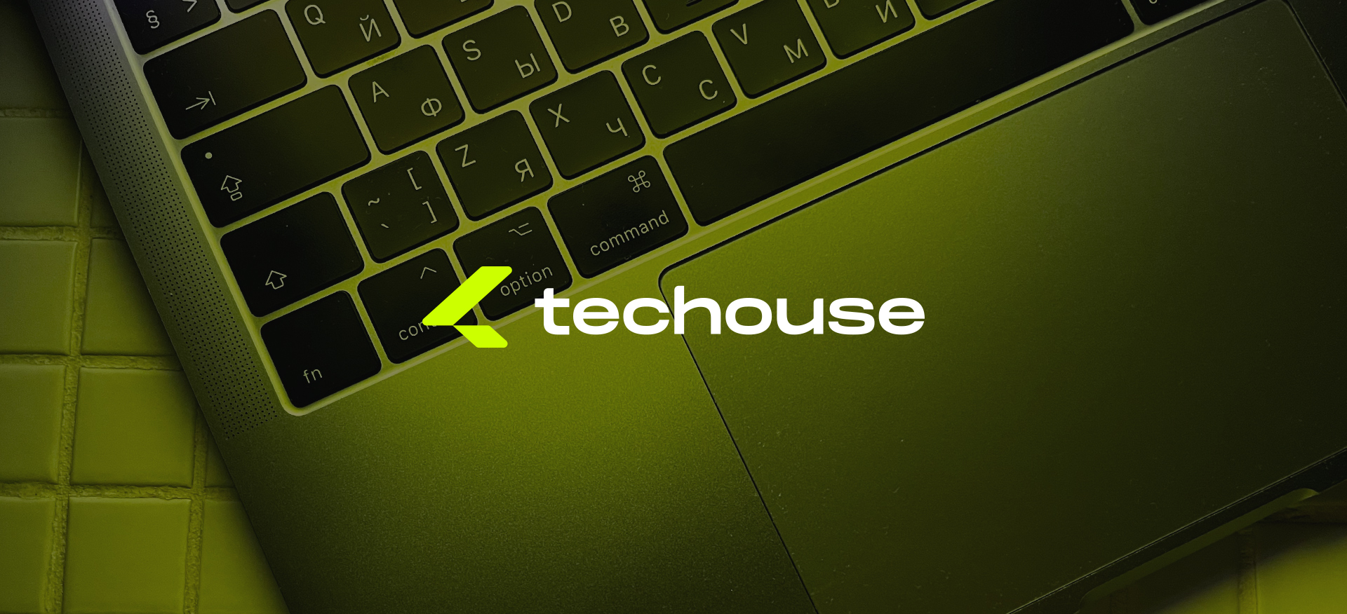
We developed brand communication media as well. Customers and employees of the company will easily remember them.
Logo grid and asociation map
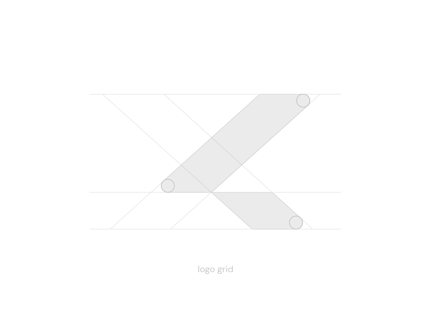
Logo grid and asociation map